Showing posts with label room. Show all posts

Saturday, February 19, 2011

Stylish Celebrity INTERIORS

I often see in the news or tabloids (no I don't buy them, I just peek when in line at the grocery store)beautiful celebrity homes. Always, they picture these over-the-top mansions from an ariel view, showing you just enough of the land, estate, pool, pool house and guest house that it leaves you mouth open, hanging on for more.

Although I will admit it's interesting to see these Monster Mansions from an exterior point of view--you really can get a sense of just how large these homes are--I know personally, I want to see more!

Don't they know it's what's on the inside that counts?


1. Jonathon Adler: bedroom via ELLE DECOR
2. Ellen Pompeo: bedroom via ELLE DECOR
3. Jennifer Aniston: living room via New York Daily News
4. Jennifer Aniston: bathroom via New York Daily News
5.  Demi Moore & Ashton Kutcher: living room via Architectural Digest, Decorator: Brad Dunning
6. Anjelica Houston Photo Via Architectural Digest
7. Rush Limbaugh: dining room via Corcoran
8. Rush Limbaugh: study via Corcoran
9. Rush Limbaugh bedroom via Corcoran
10. Rush Limbaugh sitting room via Corcoran
11. through 14. Nicolas Cage via New York Daily News
15. Manny Ramirez via New York Daily News
16. through 18. Sting via New York Daily News

Below:
Sarah Jessica Parker & Matthew Broderick's Weekend House
Photo Via elle decor
Interior design by Eric Hughes


Monday, February 7, 2011

Artwork Groupings

Is your room lacking drama? Everytime you walk into your living room, dining room, bedroom (...you get the point) you feel like something is missing but you can't quite put your finger on it? Ask yourself if the room has a true focal point.

If you want to create instant drama in any space a good way to acheive this is by adding a grouping of artwork. This look, whether acheived in nuetrals or vibrant colors, adds an instant focal point. Think outside the box. Don't be afraid to mix art with objects. If you're placing this grouping over a piece of furniture or a fireplace, don't forget to incorporate the items on the table top or mantel in the overall design.

Remember: Have fun with it! Hang a few pieces and the look is complete, or continuously add to it to create an evolving design.
{Via Jamie Drake}
The epitime of drama, this artwork MAKES the room. Without it, it would be an overly matchy, louis xvi style parlor


{Via Decorology}
All the white in this room really grounds the space, and makes the artwork grouping speak for itself

{Via HGTV)
Obviously, the paint has a big impact in this room, but the artwork placed inside each stripe sets it off

{Via decorology}
I love this. Part inspiration board, part room decor--this proves groupings can be fun
 
{Via decorology}
All about balance, this display is rich in history


{Via Sarah Richardson}
Clean lines and neutral decor. This grouping is the focal point in a very subtle way
 
{Via Sarah Richardson}
Simply because one is not enough...
 
{Via Sarah Richardson}
I love how Sarah incorporated the sconce in her grouping
 
{Via Sarah Richardson}
This room is soft and comforting, yet there are 12 pieces of artwork over the sofa, point proven

{Via Sarah Richardson}
I love how the panel interupts the grouping, yet it still flows
{via hgtv}
With 9 pieces grouped together, it acts as one large piece AND adds a whole lot of drama over this night stand

{Via hgtv}
Clean and contemporary, but with the addition of one carved gold frame on top it suddenly becomes eclectic

{Via hgtv}
enough said.


Sunday, February 6, 2011

Outfit to Room

What's your inspiration? As mentioned in the last 'Outfit To Room' posted last week, all well designed rooms start with a form of inspiration. Without it, the room often feels (and looks) disconnected. Inspiration can come from anywhere. I once had a client bring me a set of her grandmothers dishes. They were actually only 2 colors, blue and cream, but the pattern suggested the style of the room and the rest of the space fell into place.

This weeks J.Crew ad invites viewers into their glossy pages by using soft, summery hues, pretty flowers and a dainty, romantic, feminine whimsy:


I pulled this bedroom, designed by Charlotte Moss, because it conveys everything the J.Crew ad portrays. I love the way the floral curtains and the chair cushions pull the flowers out of her hair. The pretty pink toile bed skirt and canopy have the same light-hearted feel as the girl in the picture's make-up. The ruffle atop the canopy mimicks the soft, fluttery wave in her hair. The tiny flowers which make up her shirt convey a garden-like feeling---found in the botanical prints hung on the walls. Lastly, the ribbon and netting woven in her hair has a natural, organic feel---much like the texture of the natural sisal carpet on the bedroom's floor.

Wednesday, February 2, 2011

Translation: Outfit to Room

In design, I often explain to clients that they need an inspiration to begin their new room makeover. Something to grab their attention and set the room in motion. This inspiration can come from anywhere.


Today I decided to use an old Hermes ad as my inspiration picture and found a completed room that easily could have evolved from this. It's really that simple!


{Via Design Sponge}


{Via Hermes}


Translation:
  • Notice how the blonde colored wood floors are placed in a herringbone pattern across the floor? This mimicks the zig-zag patterns found in her scarf.
  • See the bright colored walls and the colorful floral fabric the ottoman is covered in? This represents her gloves and satchel.
  • The tatty and worn paint that appears to be peeling off the walls? This imitates the background in the ad...sort of like faded scenery.
  • The black and white framed artwork on the walls? This mirrors the color of the ad's snowy, mountainous background.
  • Finally, the warm, rustic color and texture of the throw on the leather chair and the books piled high behind it? This picks up the overall feel of the ad, like the woman is traveling, somewhere cold and far away. There is a level of rawness found in both pictures and the textures in the room and the scenery in the ad both share a tribal quality.
  • Perhaps some of the items sprinkled around the room, such as the kilim rug, the books, art and mirror hung above the fireplace are all treasures she has picked up on her journey....            

Tuesday, February 1, 2011

Black, the new white?

Everytime I see a well designed room with black painted walls I am in love. It's so out of the box. Unique. Unexpected. And, yes, very daring. The room seems to wrap itself around you, inviting you in. Making you want to stay for a while.

But is this look for everyone? Would YOU be brave enough to give this trend a try?

As a designer myself, I am even hesitant. Although my home doesn't call for this trend {it's an old farmhouse dateing back to the 1860's} I think it would fare well in a small space with high drama, like a foyer or powder room. Of course though, it's a must-have rule of thumb that you give this look a pop by useing white moldings or contrasting fabrics and accessories.

{Via Homes&GardensMagazine}

{Via Apartmenttherepy.com}

{Via Apartmenttherepy.com}

{Via Atlantshomesmag.com}

{Via BrandonBarrePhotography}

{Via BrandonBarrePhotography}

{Via Decorpad}

{Via DominoMag}
 
{Via DominoMag}

{Elle decor via Badgley Mischa home}

{Via Elle Decor}

{Via hgtv}

{Via Sarah Dorio Photography}

{Via Kelly Interior Design}

{Via Google Images}

{Via Lonny Mag}

{Via Martha Stewart}

{Via Windsor Smith & Michael Wells Photography} 


Monday, January 31, 2011

Basement Makeover

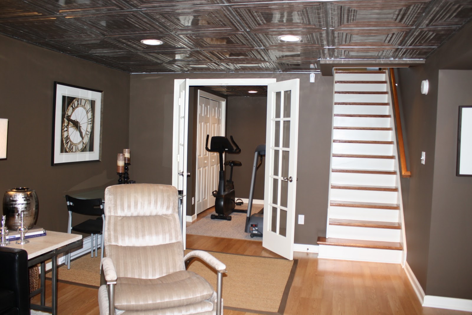
Our basement was in pretty bad shape when we bought our house.  They called it "semi-finished".  Luckily we loved the rest of the house so much that the basement really didn't matter.  And we knew we could rennovate.  I tried to keep the family room a little masculine, knowing that my husband would be spending the most time there!  I used a chocolate brown paint, black leather and black and white architectural prints.  However, I still wanted it to be warm and inviting so I added a light wood floor with a cream shag, some patterned throw pillows and a faux tin ceiling just to give the drop ceiling some interest.  The guest bedroom and bath were just all about incorporating furniture we already had and creating an inviting bedroom for our occassional house guests.

BEFORE: Staircase Area

AFTER: Staircase Area


BEFORE: Family Room Area


AFTER: Family Room Area


Before: Laundry Area

After: Laundry Area


Before: Spare Bedroom

AFTER

BEFORE

AFTER