Thursday, October 6, 2011

Walls + Fabrics = {perfect}MATCH

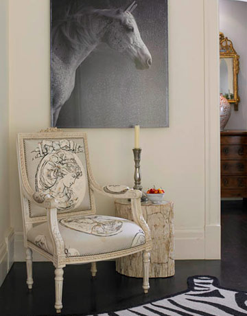
Does your space need a little pick-me up? I'm LOVING wallpaper! Not only does it add instant drama, but it brings texture to the space and sets the tone of the room.
I got to thinking about inspiration and repitition and what helps bring a room together. Why not sprinkle the same pattern around the space? It's not matchy, it's smart. And if done right, could be GORGEOUS!


 Loving that black lamp in the mix


Girly, Carefree & Whimsical.

Clean and crisp.


 Woodsy yet traditional. A cosy combo.

Fresh and relaxing.


Smart and happy and not at all overwhelming.

Chic, vintage and lived in. Like Grandmas house.


So pretty. Love how the red walls ground the room.


Delightful. But would like better if the wainscoating was painted white.

Light and airy yet formal AND comfortable.

Friday, June 10, 2011

Tips of the trade. Part 2

So, I know it's been a while since the last Friday Decorating Post, but things have been busy. This is the continuation of the Tips of the Trade. Part 2. Enjoy!

SIX. Choose paint colors LAST. I can't tell you how many times people call me to redo their rooms, but they already painted. More often than not, we end up repainting because the initial color wasn't the perfect color or tonal value. Remember, there are endless amounts of paint colors, hues, shades and variations of every color imaginable...why would you pick a paint color without first deciding what the rest of the room is going to look like?!
Find an inspiration, like an area rug or a piece of art and pull your colors out of them...then you'll know just how much color--or lack there of--you want the room to have.
Via Martha Stewart

SEVEN. LEATHER lasts longer. Have a pet? Destructive children? Afraid of spilling wine or food on your sofa? Well, leather is your answer. Not only will it stand up to all those things, but it will simply last longer. Plus, to clean it, just wipe it with a damp cloth and it's as good as new.
Why? Because leather is a natural material...just think about what those animals went through grazing in the pastures and running wild in the wilder! Their hides held up to some pretty rough and tough day to day activities. Now imagine a pretty fabric going through all that...it wouldn't last very long, would it?
Via Pottery Barn
EIGHT. Don't forget to dress your WINDOWS! Why decorate and design your whole room, but leave the windows bare? They will stick out like a sore thumb. Once you dress them, your room will appear cozier, more inviting and complete.
One of the biggest qualms I hear from homeowners (sorry boys!) is that they don't want to hide the wood moldings. Here is what I say to that: 1. We can choose a treatment that doesn't cover them, like an inside mounted roman, for example. and 2. Get over it! There are wood molding throughout the rest of the house that you can look at!
Private residence in Clarks Summit, PA, Interior design by Tara

Private residence in Scranton, PA Interior design by Tara
NINE. Mix your FINISHES. Refrain from buying a "Set" of anything...sofa and matching chairs, end tables, or lamps. Sometimes it's best to mix it all up, including the stains. Every piece of furniture can't be brown!
Try putting a stained rectangle end table on one side of the sofa, a painted round one on the other side, and throw in an odd object near a chair, like a stack of boxes, an old small trunk, or a wicker stool to use as an accent table. This will create instant visual interest and drama in the space!
Via Pottery Barn
This even works well with your doors and trims. Who says it has to match?!

TEN. Don't forget to decorate your kitchen! Often, it's the most used space in your home and where your guest's gather. Your kitchen doesn't have to be just counters and appliances. Consider antiques for storage and as beautiful accents. Charming dining tables can be added to almost any size kitchen. Look for drop-leaf tables with chairs or stools that can slip underneath, or try a round table with rich, upholstered fabrics.

Group and display artwork, choose unexpected task lighting, pick a dramatic paint color, add area rugs, dress those windows and mix and match your cabinets!


To view the source of the last two pictures and to look through other great kitchen images follow this link. Thanks!

Tuesday, May 17, 2011

Must have accessory: a new puppy!

Get ready to cuddle up with a new must have accessory for your home...a new PUPPY! Seriously, how can you resist?! I've seen them myself and tried to hide them in my coat! I had to share them, they are just too cute...


Caesar Maximus..aka Max (father)

About the pups: Puppies are 3 weeks old, are vet checked and have registered papers. They are home raised, not kennel dogs. We have 5 females and 4 males that are blue, fawn, black and brindle. $900-$1,100.

About the parents: Both sire and dam are on premises. These mastiffs are hardier, stronger and faster than AKC English or Bullmastiffs. They have a longer life expectancy and have excellent hips. Visitors are welcome to see them run and instantly see the difference for yourself. These dogs can be compared to a well breed cane corso or bandogge.

About the breeder: Breeder has 15 years of experience, requires a completed application and a 25% deposit. Also offered is crate training, socialization, basic obedience and proper foundational walking for an additional weekly fee if desired.

Serious inquires only. Phone calls preferred 9am-9pm. Call Greg at 570.955.8708 or email tara@designgatheringhome.com

Friday, April 22, 2011

Tips of the Trade. Part1

I've decided to just put it all out there. Share insider tips, tricks and secrets of the trade to all of you who write to us seeking advise to your room dilemmas. Sometimes all a space needs is a few easy tweaks and POOF! Like magic the rooms takes on a new life. And I bet that if you follow the simple steps outlined below you will not only use your room more, but you will feel better when using it. Good luck and enjoy!


One. LIGHTING. Every room should have lamps, I don't care how many cans you have in the ceiling, there is nothing like lighting on your level. Keep it simple: a good rule of thumb is that there should always be a triangle of lighting a space. Not only will this help with creating ambiance and task lighting, but it will also lend a helping hand in where your furniture should be. Notice the 2 small lamps behind the sofa?...Don't be afraid to layer lighting!
            TIP: Need a chandelier over your dining table but not sure what is too large or too small? Measure the longest wall in the room. Double it. Convert it to inches. That number is the smallest size the chandelier should be.


Via HGTV Interior design by: Loretta Willis

Via House Beautiful. Photography: Christopher Baker. Interior Design: Robin Bell

Two. GROUND YOUR SPACE! Feel like something is missing in the room? Add an area rug. Without it the room has no connector. Or, try skirting your upholstery. The room will suddenly feel weightier simply because solid pieces are grazing the floor (rather than looking through the legs of wood pieces).
               TIP: Place your area rug in the direction of the sofa. The longest line of the rug should parallel the longest line of the sofa. And, the longer sofa should be placed along the longer wall of the room. It should also be large enough to connect the rest of the upholstery. Otherwise the area rug becomes a mat for your coffee table and is completely out of scale!

Via HGTV

via HGTV. Interior Design by Andreea Avram Rusu
Three. CREATE VISUAL INTEREST. Load on the texture and add up the pattern. You can never have too many pillows on a bed. They make the room feel more luxurious and inviting. Play around with size, pattern, shape, texture and color to create a "rhythm" in the room. Pick a contrasting color to the bedding or pull the color out of another object on the opposite side of the room to draw your eye to it. Add more pillows to your sofa, 2 is NEVER enough!!

Via HGTV

Via BHG

Via HGTV. Interior design by: Erinn Valencick


 Four. DEC{orate}THE HALLS. Besides, you walk though them all day long to get to your other rooms, so why not make them look good? Place a runner in a narrow hallway or a larger area rug in a bigger space (yes you can do this over wall to wall carpet). Hang some artwork, sconces and dress the windows if you have them. If room allows, place a narrow bench with some pillows on it to cozy up an otherwise "dead space".

Via Elle Decor.
 
Via House Beautiful. Interior Design by: Stephen Shubel


Five. DISPLAY STUNNING VIGNETTES. This may be my favorite! A good vignette represents a design principal we like to call "heaven, man and earth". Which basically means that you have high objects, low objects and objects in the middle.


Via Elle Decor

Via House Beautiful
  

Saturday, April 16, 2011

Magazine Rack Redo

 
Simple piece, fabulous results.......


Anyone that knows me knows I am a bit obsessed with gold right now...I've also been a bit "spray paint happy" with it!   I am also obsessed with anything vintage, and really good deals...

I picked up this "dud" at my local thrift store today for $1.00...yep, one dollar magazine rack redo!

A little fab spray paint, and check her out!!! 

What a quick and easy project with great results! 

I bet all the gals will be asking me about this one at my upcoming house warming party!

 More quick and easy redo's to follow.......stay tuned!!


xo,
Nicole
 

Friday, April 15, 2011

Walk in my walk-in

The days of bedroom closets with bi fold doors and plastic Shelftrack shelving is over. Make way for the era of CUSTOM. Custom kitchens, custom furniture, custom wedding dresses, even custom appliances. So why stop short with your closet? After all, isn't it one of the most important and most used rooms in your house? I know I spend a lot of my time in mine!  

See TIPS below to give your closet a quick face lift!

Below are some unique and truly draw dropping gorgeous closets. Inspired by famous kitchen designers (like Clive Christian and Christopher Peacock), Parisian boutiques and trendy high end clothing stores, these closets will make you want to redo yours...


TIPS TO GIVE YOUR CLOSET A FACE LIFT:
  • Try painting it a fun color. Pick a color you would be more hesitant on choosing for one of your main rooms, like fuschia, peacock blue or glossy black!
  • Line the walls with wallpaper to make it feel more cozy and inviting
  • Add a unique light fixture or chandelier to the ceiling
  • Hang artwork
  • Add texture by stacking woven baskets on top of each other that hold scarves, gloves or clutches
  • Place a scented candle, satchel or plug in in a disguised area....there is nothing better than walking into a space that smells as good as it looks, it just makes you want to stay longer :)  
  • Add an upholstered bench, ottoman or chair to soften the look and to give you a place to pile clothes!
  • Try "displaying" your bags and jewelry. It will not only look cool, but I bet you will wear it more often simply because you see it!

Thursday, April 14, 2011

Grilled Peach and Mozzarella Salad

Because I am a vegetarian, I jump at the thought of any grill recipe without meat!!   This is a great summer salad that can stand alone as an entree or accompany any meal.  If it is still a little too cold outside for you, make it indoors on your grill pan as I did here. -xo Carinne

You will need:
5 peaches
3 green onions, sliced
1/4 cup chopped fresh cilantro
3 Tbsp. honey
1 tsp. salt
1 tsp. lime zest
1/2 cup fresh lime zest
3/4 tsp. ground cumin
3/4 tsp. chili powder
1 1/2 Tbsp. tequila (optional)
1/3 cup olive oil
vegetable cooking spray
3/4 lb. fresh mozzarella cut into 1/4" slices
1. Peel and cut one peach and set aside. Cut remaining 4 peaches into 1/2" thick rounds
2. Coat grill pan (or grill grate) with cooking spray and grill peach rounds covered for 3-5 min./side
3. Process chopped peach and remaining ingredients- except mozzarella- in a food processor until combined
5. Plate salad by alternately layering grilled peach rounds and mozzarella.
6. Top with desired amount of peach dressing and serve